Cover Art Poll
It’s come to my attention that people are just not finding Lioness of Cygnus Five. That is, the people who have read it have liked it enough to seek me out in order to tell me so and hassle me about when the next one is coming out. So I know the book itself is okay. But it’s not selling, which means that people are not picking it out of a lineup and going “that looks like something I want to read.”
This is not a new problem. Initially I thought it might be because its first cover was kind of amateurish and offputting. Eg
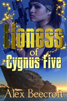
This time, while I am much much happier with the professionalism of the cover, I’m beginning to think that it says “Hard SF” rather than “fun Space Opera/Pulp Science Fiction.” Eg
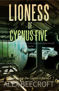
I think people must be looking at that and expecting a science heavy tale of deep space exploration, only to be disappointed when they read a blurb that promises something closer to Stargate meets Honor Harrington.
So I have re-made the cover yet again, and I need your advice on it. I like the pictures but I can’t decide on the fonts. Given that we’re thinking Space Adventure with Aliens, which one do you prefer, A or B?
A.  B.
B. 
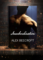
I like the new cover very much. And I prefer B, with the emphasis given to Lioness.
Thank you! Oh cool – B is definitely carrying the day, with only one vote for A and one undecided. It’s always reassuring when there’s a definite preference. Thank you so much for your help!
(Are you going to be coming to the RNA Christmas lunch, btw? I’ll be there.)
I like the one on the right (b) but “of Cygnus 5 doesn’t show up at all in black. It would stand out more in white – or if you want it just a little less bright than “Lioness,” maybe yellow.
Yellow definitely sounds like the way to go. Thank you! Now I have a plan 🙂
Actually, I liked the original cover best (!) – and I fully intend to buy the sequel. But if I had to choose between the other covers I’d go for A but only because the full title is easier to read.
*G* Thank you! If you want the sequel I could send it to you with the current cover. I have a replacement cover for that too, which will be going up as soon as I re-do the text on everything. I like the serious sci-fi vibe but I’m not sure it actually is 🙂
I prefer cover B but something definitely has to be done to ‘of Cygnus Five’ to make it legible. As it is, I can’t read it even knowing what it says. You could try making the font bolder (although I’m not sure that would be enough), or as has been suggested already, making the font another contrasting color such as yellow. Other than that one issue, I do love the new cover.
Thank you! It’s wonderful to get such a consensus of opinion on cover B, and then to also get the advice to lighten the second line is an unexpected bonus. It’s very kind of you to pitch in. Thank you!