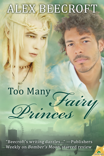
Too Many Fairy Princes: the Cover reveal :)
On the one hand, conceptually it’s not earthshatteringly new. There must be millions of two-blokes above scene covers out there. On the other hand, I still really like it.
Happily, I couldn’t quite get the word count on this one above 60,001 words without making a deliberate decision to pad it. So I left it at 59, 223 words. Samhain’s policy on length is to price anything above 60,001 words at $5.99 and those things which don’t quite make the length at $4.99. Which means that this one’s a bargain length for the price 🙂 (Or a bargain price for the length? Something like that.)
Must go and update my website and sidebars 🙂


Very pretty! I love the green colour, and each of the guys looks like a distinct individual.
I like the two-blokes-above-a-scene format, and it fits with your other covers.
Yes, if it isn’t broken as a format there’s no real need to fix it 🙂 And I’m just really pleased at how close they managed to get to the characters as they were in my mind. Thank you!
I don’t know, you go away for a week and so many posts to catch up with.
Love this cover. The background colour, the font they used for the title, the scene partial lost in cloud. I’m fond of the ‘blokes above a scene’ format too. But I’m most jealous of the awesome quote you have on the cover. Congrats.
Yes, it’s very different from the palate of all my other stuff, which makes a nice change, and they both have interesting faces with lots of character, as opposed to just being there for the muscles. I like that 🙂
Thank you!